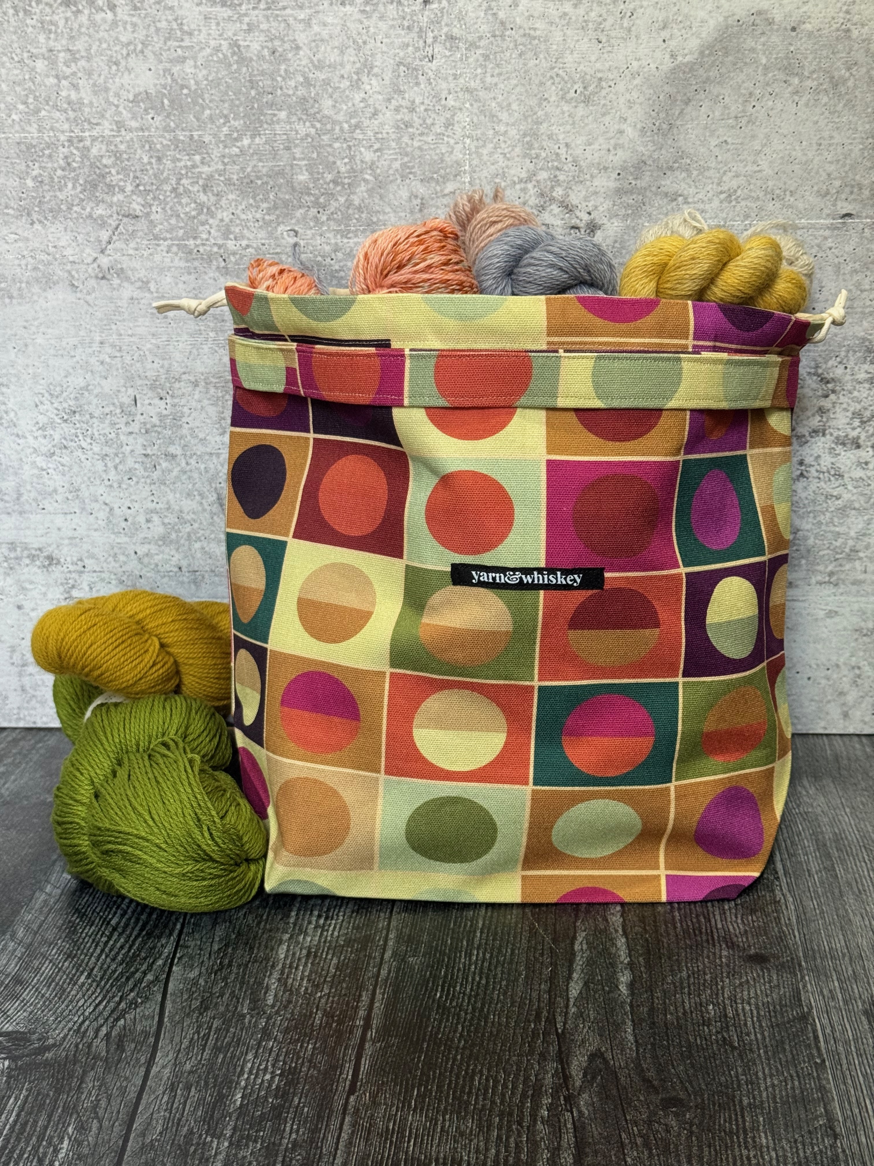
Less Is a Color Story: The Design Behind Palette Study No. 1
Posted by Tammi Williams on Aug 4th 2026
On my way to Heriot Watt for a semester abroad in the Scottish Borders, I cracked open Lauren Wagner's book, Palette Perfect: Color Combinations Inspired by Fashion, Art and Style. It's a book about color theory that was recommended by one of my instructors and being a good student, I bought the book and brought it along to Scotland.
The thing I liked about it was that the illustrations got to the heart of color interactions by the way it displayed colored shapes within other shapes — circles in squares. It was Josef Albers but make it fashion. As I worked on my designs that semester, I decided to try Wagner's system of finding color harmony and combinations as I worked through choosing my color palettes. I selected colors based on trend research and created my own circles in squares to see how they interact before settling on the final colors in that year's collection.
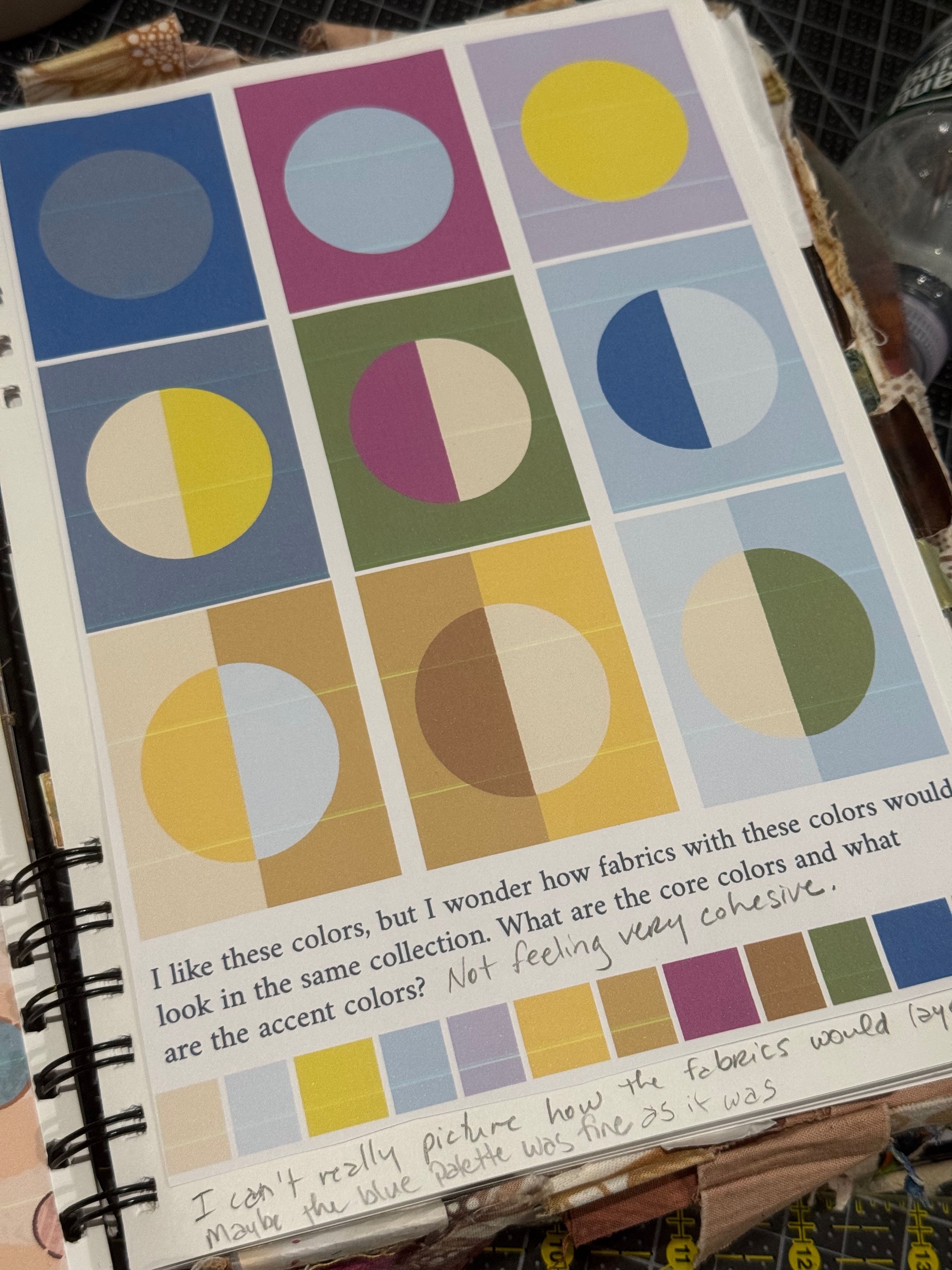
Yes, this is me critiquing my own color palette in my sketchook.
I filled my sketchbook with pages and pages of different color combinations until I decided on the perfect palette. Upon seeing these objects in my sketchbook at critique someone suggested I use them in a design. I was a bit incredulous. I thought my designs should have more layers, more varied motifs. More. I thanked the person for the suggestion but did not end up taking the advice.
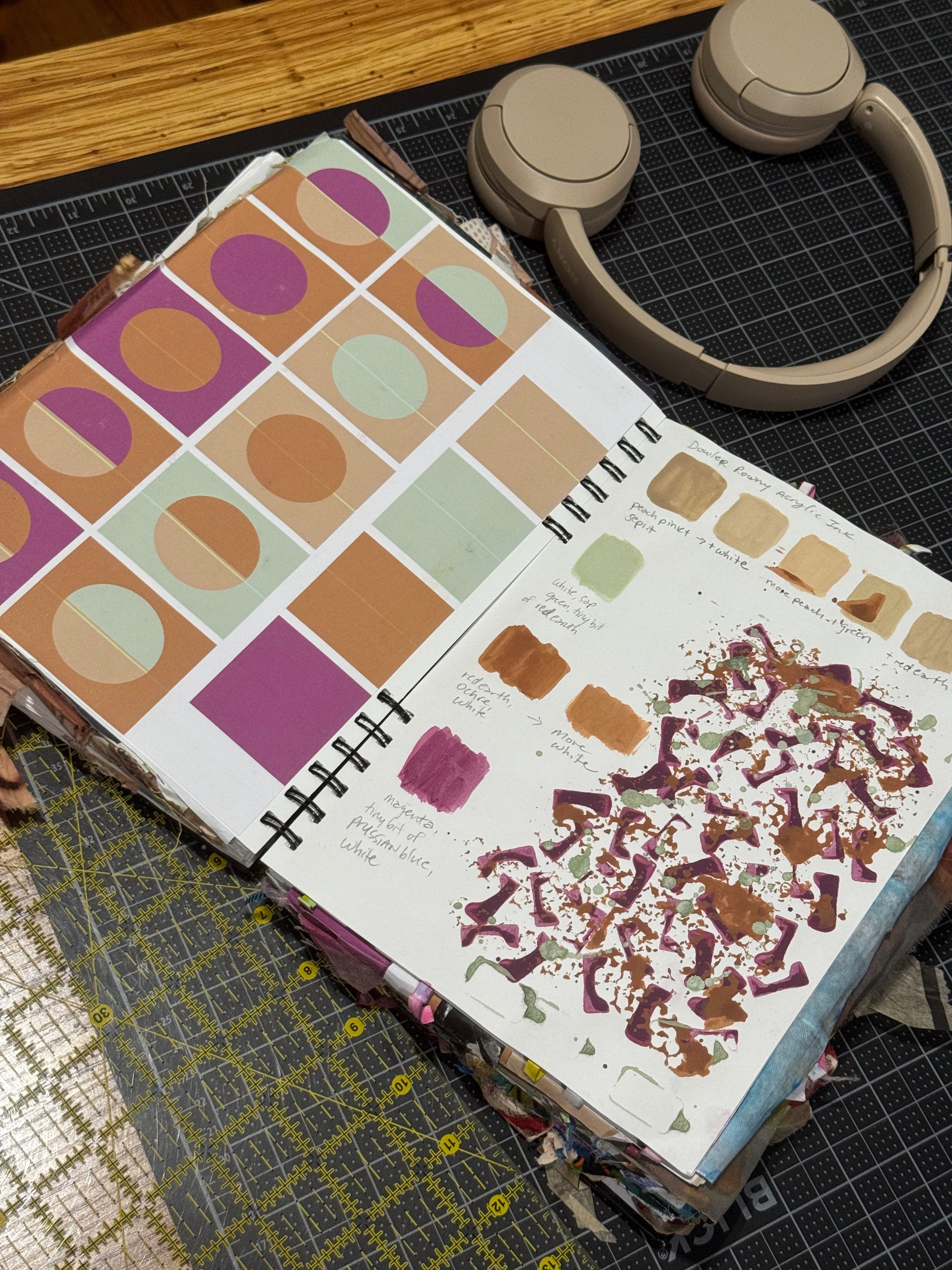
Photo of my sketchbook of the page when I finally got the colors right.
A few months later, I found myself in Paris wandering around the Les Puces flea market pawing through some vintage silk scarves and I came across a 90 cm Christian Dior silk twill scarf featuring, you guessed it, motifs of circles in squares. Even though the scarf was torn in two places, I bought it and kept it for my archive. It was proof that the process could be a standalone design, that sometimes less is more, and that when it comes to textile design, color does a lot of the heavy lifting.
If it was enough for Dior, it was good enough for me.
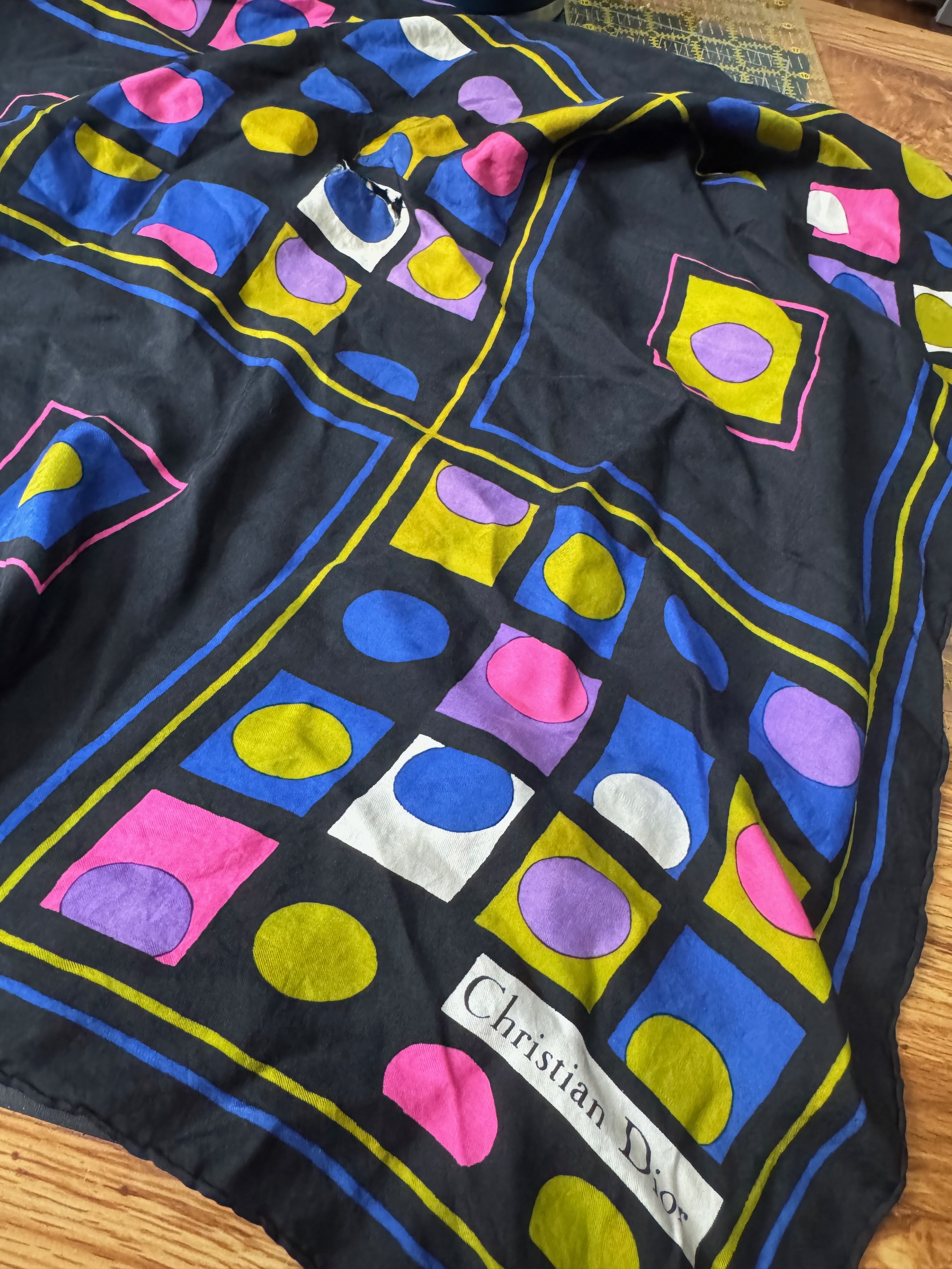
I was recently in Colombia with a little down time after dropping some fabric off at my manufacturer. While in a cafe on the 27th floor of a residential building with a goregous view of the mountains covered in mist, I pulled the scarf out of my bag for inspiration and got to work on my own design. Fabric was submitted for printing and ordered before I left Colombia.
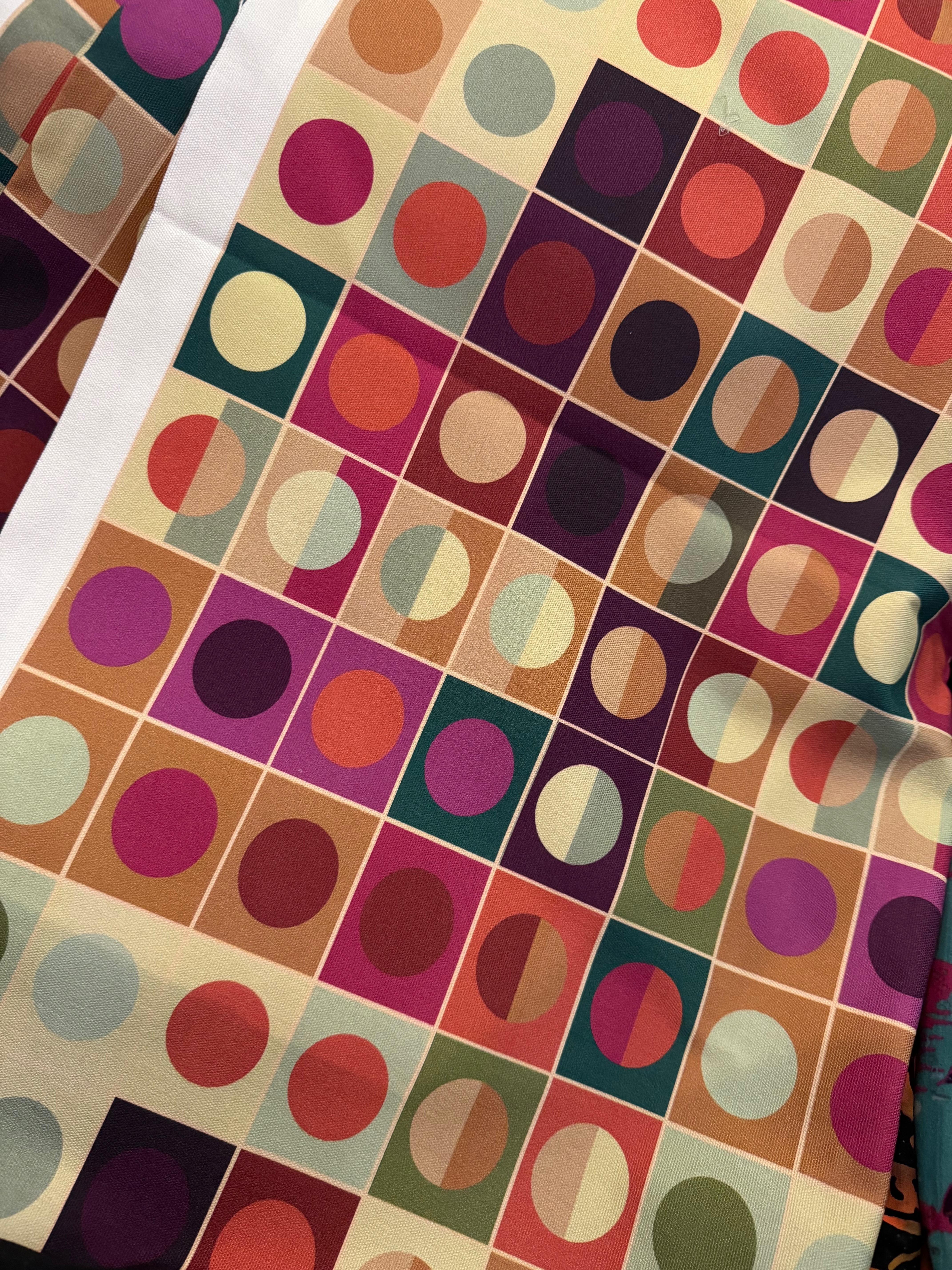
My fabric arrived a few weeks later and I posted it immediately to my Instagram stories. The response was massive. People seem to like this design, which I am calling Palette Study No. 1. Sometimes the simplest ideas have the biggest impact. The person at critique knew it. Dior, of course, knew it. And now I know it, too.
Not every design needs More of Everything. Just as long as it's got a good color story.